Disclaimer: I know what they say, “don’t criticize other people’s work.” I’m sorry, I have to part with that. As an educator in photography, I feel it is necessary to inform my students of both the good and bad. Our professional magazines should be upholding the standard of quality in this industry. What appears in the magazines is seen by the aspiring photographer as the standard to attain. When our magazines publish sub-standard material, this needs to be called out, so that the new people in the industry understand what true quality is. If we allow sub-standard to become the acceptable as “professional” then we are for not.

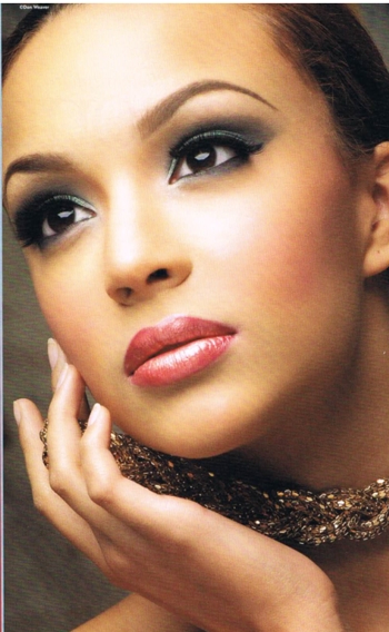
This is the cover of the November 2011 issue of Professional Photographer. This portrait is not flattering. It is lit with a small light source placed above the subject’s head. This type of lighting, called “butterfly” or “glamor” lighting and is not unique; but it is reserved for faces that are perfect because there are no shadows to hide the flaws in the face. You will most often see this type of lighting used in advertising for cosmetics. The subject of this portrait does not have a perfect face. Furthermore, there is no post production work. Every wrinkle and pore on this woman is painfully visible.
What really baffles me about this cover is that it was a contest, and this was the image selected by a skilled photographer that I used to have respect for.

Here is second place image. A wonderful portrait that is beautifully lit with a large light source (same type of lighting used on the cover shot, but with a larger light source). The face is beautifully sculpted and the hands do not interfere with the face.

Third place. A wonderful image with some excellent tonal control. Here detail and pores are not a bad thing. Wonderful composition with the hood and the eyes just penetrate out of the darkness.
Yancy had better images to select from. To place that image on the cover is a slap in the face to professional photography.
The Foster Photographic Arts universe:
General Portraits and Picture Restoration
High School Senior Pictures
Weddings
Photography Classes
Architectural Photography
You must be logged in to post a comment.